This guide walks you through all the different sections contained within the Brand pill. The Brand section of your LMS is located in the admin tool. And from there, you can control many of the digital assets that are displayed publicly on the front end of the site.
Default Thumbnails
This is where you set all default thumbnails for modules, various pieces of content, dialog boards, pages, badges, and certificates. The image you upload here is the image that will auto-populate as the thumbnail whenever you create any one of these elements.
Default Banners
Here, find default banners for each of the four dialog types. The images you upload here will auto-populate in a dialog once it’s created.
Default Profile Image
Also known as an avatar, this is what users will see as their profile image when they first log into the site.
Custom Text and Highlight Colors
You can manage color options for text within a module using the text block feature.
Please note: All other text colors found in the LMS are chosen during the skinning of your site.
You can add colors simply by clicking +add Custom Color. Enter in a Hex Code or RGB number in the box that pops up on the right-hand side:
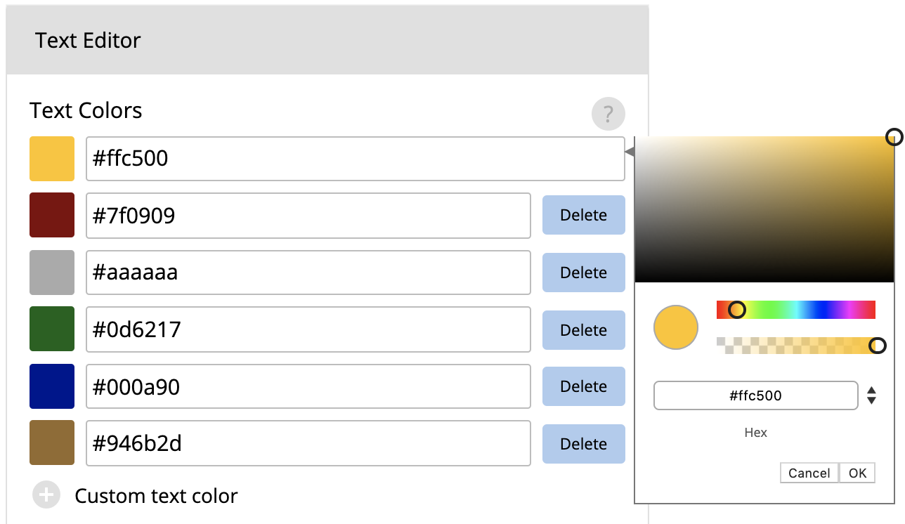
Text Color
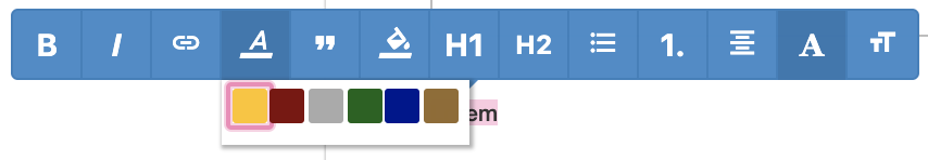
Once you enter the text within a text block, your color options will display as shown below:
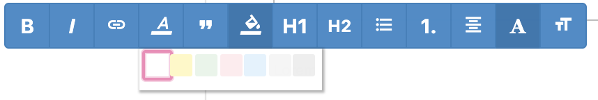
Highlight Colors
Highlight colors are color options that can serve as background colors for text. These are added the same way that text colors are (shown above).
Fonts
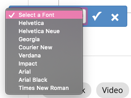
Send your font file to your CX rep and our team will get the font added. You’ll then see these options displayed within a text block when you go to change the font for your text.
Pretty simple, right? This pill is one of the quickest wins as an admin. Just load in some default images, so you won’t have to worry about those later! This also helps if you have a larger team—all of the default images will be the same! Win-win!